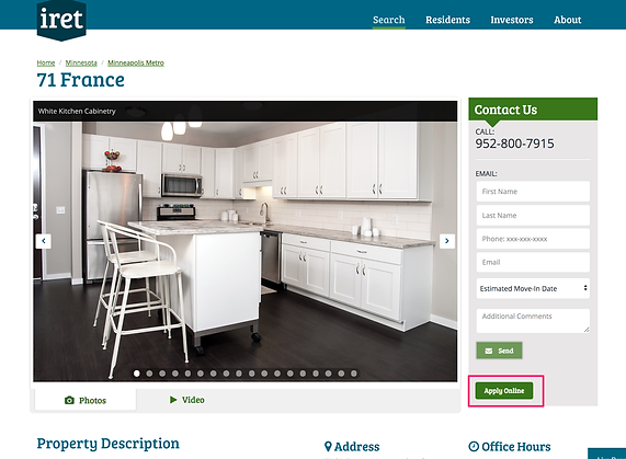
It is a place where potential residents go to provide information about themselves, to be considered for living in an apartment community. The property management team uses this information and the associated credit and criminal screening results to decide if they qualify to live in their community.
The Challenge
The existing version of the application was able to collect the basic information to process the screening, but it had some challenges. For example, the application had significant initial dropout rates, responsiveness issues and collected less data overall by encouraging users to skip sections easily.
Setting Goals
The product needed to transform to a state where completing the application should be simpler, efficient and the questions being asked should be relevant to the applicant so as to capture and maintain their attention throughout the process.
The product should also overcome scaling issues and should reduce confusion and encourage completion.
So the high level goals were to,
-
Improve completion rates
-
Increase engagement
-
Scale effectively on all form factors
-
Make the flow simpler and less confusing
My Role
I was the Product lead and the designer for this product, and was tasked with understanding the issues with the current application module and define the scope of this effort and execute on it. I led the needs finding, ideation, detailed design, project planning and execution with Engineering.
I was the only interaction designer on this project. I collaborated with a team of two visual designers to transform my designs to high-fidelity.
The Process
Collecting Insights
I started off by understanding the goals of the original application module design, from the designers who originally designed and built it. I then kicked off my own needs finding exercise by carrying out contextual inquiries with users, to understand their pain points and needs.
By observing people who were filling out their application and asking them to talk aloud as they were filling it out, I was able to capture valuable qualitative feedback. I captured detailed notes on the interaction and identified specific areas to improve, where the existing product fell short on.
This exercise also gave a baseline for metrics that we’ll track to evaluate the success of the product.
As I was analyzing the data, it was clear that a redesign was necessary to effectively address the shortcomings of the current design.
Time to Ideate
Having understood the problem and the need, I went to the drawing board to start capturing some rough ideas that I had in mind to address specific scenarios.
I then defined the user journey for the application process. The flow started coming together piece by piece.
It was clear in my mind, that the flow has to be structured, to maximize information capture, and so I wanted to try a wizard approach to gather all this information. The wizard approach would also help the responsive aspect where it can be easily scaled down to smaller screens, if the data is collected in chunks.

This is around the time when the company was moving to using Figma as a design tool, which bridged the gap between interaction design and visual design tools and helped the IxD and VD teams to collaborate on projects.
After the initial white boarding sessions, I started transferring the designs on to Figma and iterated in Figma thereafter.
What's different this time around?
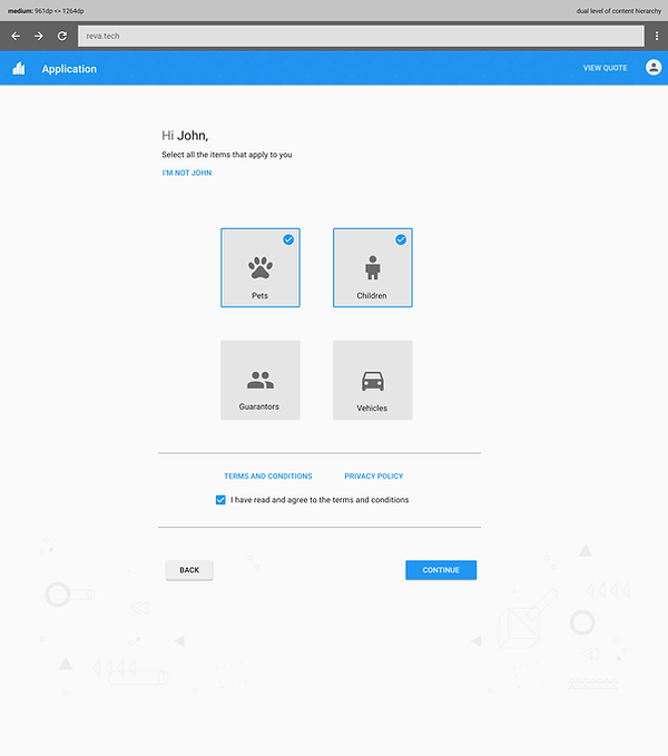
The application was redesigned to ask questions to the applicant in the first step, to see what aspects of the application were applicable to them and then collect data for only those relevant pieces of information. I validated this approach during a user study and it had a substantial impact on the motivation of the applicants in completing their application as it held their attention throughout the flow.
It also naturally shortened the length of the application, to focus on only the relevant things (e.g. if someone said in the first step that they do not have pets, the application step to collect pet information and vaccination records will not be presented to them).
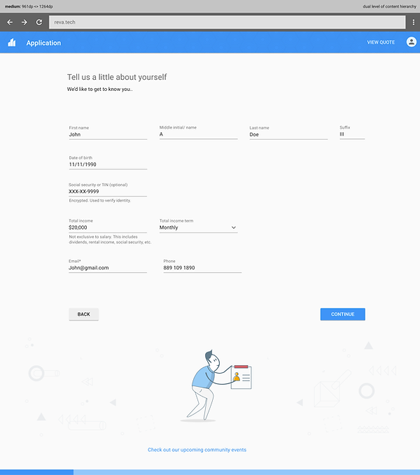
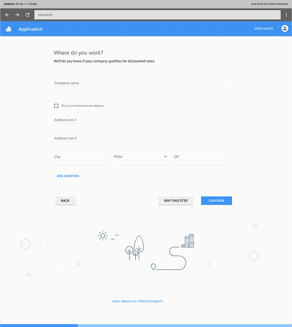
The information collection was chunked and each step only asked about a specific topic (for example, Step 1- Introduction, Step 2- Past address, Step 3- Work information etc.)
Also, each step begins with a statement or a question to ease them into answering the questions that followed. The frequent reassurance that the changes were auto-saved, made the applicant feel confident of the progress made and didn't make them feel rushed to complete their application.
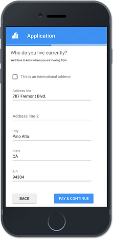
Looking at the existing application traffic data, we found that 67% of applicants completed their application using a mobile device. The nature of this redesign was carefully considered so that scalability to a smaller form factor was inherent. Here's an example of how the application would respond to its smallest form factor.

Outcome: A positive change
Clickable prototypes were created from the final designs and a usability study was conducted. The participants were given scenarios to run through and I was able to capture metrics to validate against the goals set earlier.
The study showed that completion times improved by 30%, and engagement went up by 84%, and the subjective feedback confirmed that people were more inclined to finish the application as it was short and tailored to their profile.
Lessons learned
-
Continuous monitoring of product usage data helps with understanding how a product is being used, and in identifying trouble patterns. In this project, looking at the usage data of the existing product helped us identify the issues with dropout rates, completion rates etc, and identify targeted solutions that’ll improve these metrics.